
Here we are going to write a series of blog posts on data visualization. We will use a particularly interesting data set, exhaustive data on US university admission rates, post-graduation salaries, etc.
The Importance of Data Visualization
Data visualization means graphs aka charts. When working with big data and analytics the programmer and data scientist can most easily see the relationship between data variables using graphs. Further it is the best way to show those results to non-technical people.
Graphing can be complicated as there are so many types and variations. But that heavy-lifting is made easier for Python programmers using matplotlib and Zeppelin. Matplotlib is particularly useful because it works with Python Pandas data.
College Admittance Data
First, the data we will use is here. There are many data sets and literally thousands of fields there. So we will use only a few. The data fields are documented here. An overview of the data is here.
Also, the code we write below is here.
Chart Types
First, the basic chart types are:
- histogram
- line chart
- area chart
- bar chart
- scatter chart
This are best understood by looking at examples.
Data Types
Then there are data types. For all practical purposes, you are limited as to how many variables you can put on a chart by your eyes, because the chart can get too crowded to see. So we will start with two (bivariate).
| Univariate | This plots one variable against itself, e.g. schools groups by tuition rates. |
| Bivariate | This is the familiar x-y chart. It plots one variable against another. This is useful for showing the correlation between variables and clusters of data points. |
Sample Python Code
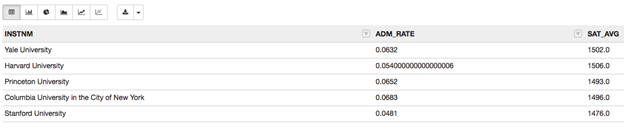
Let’s define elite schools to be those that take fewer than 7% of applicants. We read the data directly from the government web site. We pick three fields: the university name (INSTNM), admissions rate (ADM_RATE), and average SAT score SAT_AVG. Obviously the admission rate (ADM_RATE) and SAT score are going to be correlated.
Create a Zeppelin notebooks and paste this code into that. You cannot make graphs using the python command line interpreter. You need a display capable of supporting graphics, Zeppelin running the browser supports that. (If you do not know Zeppelin download it from here. The easiest way to install it is to unzip it then run bin/zeppelin-daemon.sh start. Then in a browser open http://localhost:8080.)
The code below reads the data into a dataframe.
import matplotlib
import pandas as pd
df = pd.read_csv('https://ed-public-download.app.cloud.gov/downloads/Most-Recent-Cohorts-All-Data-Elements.csv', usecols=['INSTNM', 'ADM_RATE', 'SAT_AVG'] )
Before we show how to plot a graph using matplotlib, we can use the Zeppelin z.show. Nothing can be easier as it shows the data in table format then lets you click to create the most common chart types. The icons below show those. Reading left to right, the first is the table display, the others are bar, pie, area, line, and scatter.
![]()
It takes one line of code to create that
z.show(elite)
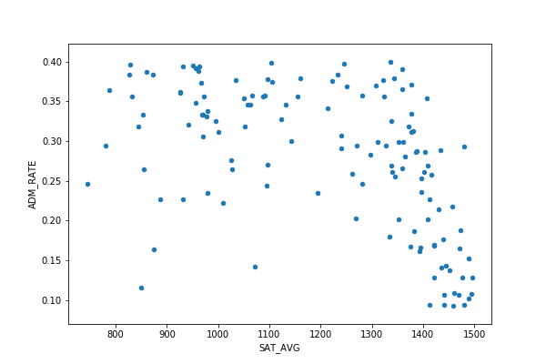
There is not enough data to make a busy chart, so let’s widen our selection to 134 schools and create a data frame called excellent.
excellent.shape=(134, 3) tells us there are 134 schools that take between 9% and 40% and of applicants.
excellent=df.loc[(df['ADM_RATE'] < 0.4) & (df['ADM_RATE'] > 0.09) & (df['SAT_AVG'] > 0)]
print(excellent.shape)
Hexplot
We could make a scatter plot (shown below), which shows data points. But a chart like that can get crowded, making it hard to read. Instead let’s use hextplot. It draw hexagons around data points that are near each other and colors them based upon the density of that cluster.
excellent.plot.hexbin(x='SAT_AVG', y='ADM_RATE',gridsize=25)
As you can clearly see there is definitely a high level of correlation between SAT scores and admission rate.

That’s easier to read than the scatter plot:
excellent.plot.scatter(x='SAT_AVG', y='ADM_RATE')
Bar Chart and Univariate Data
We don’t have any categorical (e.g., accepted, rejected) or nominal data (like an allocation of students into some ranges) that can be plotted against itself, so let’s make some.
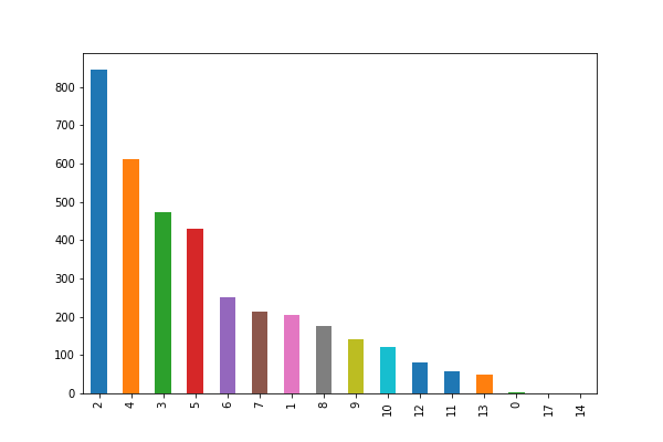
Read the data again, but this time get the tuition (COSTT4_A). Then we can group schools into categories by diving the tuition by $5,000 and rounding to the nearest integer.
costs = pd.read_csv('https://ed-public-download.app.cloud.gov/downloads/Most-Recent-Cohorts-All-Data-Elements.csv', usecols=['INSTNM','COSTT4_A'] )
We write the expense function to do that.
def expense(tuition):
return int(tuition/5000)
tuition = costs['COSTT4_A']
nominalCosts= tuition.dropna()
Now we use the value_counts Pandas function to group and count schools by tuition. Note how the plot matplotlib function works directly with Pandas dataframe.
costRange.value_counts().plot.bar()
Out of the 3,655 schools, more than 800 cost less than $10,000. But 13 of them cost $65,000.
In the next blog post we will explore other graph types and how to add more features.