This is part of our ongoing series on Tableau. In this article, I’ll show how to join Tableau tables on a calculated field and how to create a table text, which is also known as a crosstab table.
Getting the data for Tableau
To illustrate a variety of Tableau functions, we’ll continue looking at the same three stocks: Starbucks (SBUX), Johnson & Johnson (JNJ), and Disney (DIS).
Download the data we are using from here. There are three tables in that zip file: price, earnings, and dividends. We will look at price and earnings. Set a filter to extract only SBUX.
A note on the terms:
- Price is the stock price.
- Earnings are the quarterly filings.
How to join Tableau tables
For whatever reason, the filing dates for Starbucks (SBUX) earnings always fall on a Sunday. We need to do some math to change that to Monday, so that we can match up the stock price with earnings. (The stock market is closed on Sundays.)
So, we’ll create a calculated field to join the two tables, which adds a new field to the earnings table that will match a field in the price table. (Of course, that means we will lose data for those Mondays which are a holiday. You could, as an exercise, try to fix that.)
The two tables have these common elements:
| prices table | Symbol | Date |
| earnings table | Symbol | Quarterend |
We calculate:
| DATE([Quarterend]) + 1 |
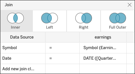
And use that as our join criteria.
So, we add a calculated field to our join criteria.
We will make an inner join, which will match up records with the same stock symbol with the stock price date and the earnings date on the Monday after the filing.
So, the number of records we will have will be equal to the number of quarterly filings. Our data is from 2010 to 2018.
Click below to add this calculation on the earnings column.

This takes the Quarterend string, converts it to a date then adds 1 to it.
Then the join criteria will look like this:
How to create a crosstab table
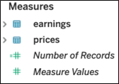
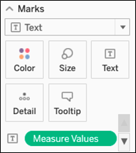
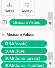
In the worksheet view you see the both tables: earnings and prices. The easiest way to make a crosstab table is to drag measure values onto the Text mark.
Then drag Measure Names to Columns.

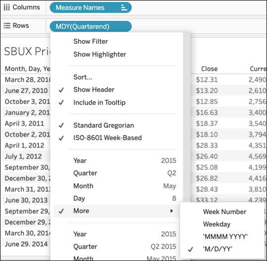
Then drag Quarterend date to Rows, since we want financial data by date. Format the date show that is shows the full date. Tableau tends to collapse that to year, as it assumes we want to do aggregation. (That’s logical since, in most cases, you want a report to sum data. In this case, we want the report to show all the data.)
Add the Measure Values to the filter tab and then deselect fields until you have what you want to see. For financial analysis that would be the balance sheet values assets, liabilities, and cash and profit and loss value earnings.
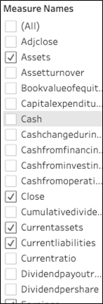
Tableau always assumes we want to sum values. For the sake of simplicity, we will leave it at that, because we have only 1 record per date. So, the sum and individual values are the same.
Now the worksheet shows these Measure Values. If we had not dropped Measure Values on the Text Mark it would show abc in every field. Not sure why that is; it just behaves that way.
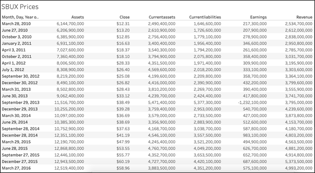
Our complete report of stock price on earnings data looks like this:
