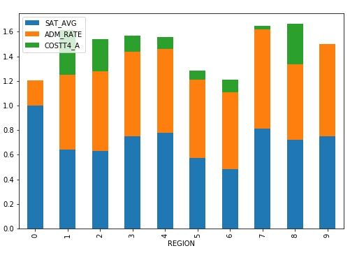
Here we want to look at the matplotlib stacked bar chart. We will use data on all US Universities located here. In a previous post we first looked at that data. The code for this exercise is here as a Zeppelin notebook.
The college data includes region, tuition, SAT average, admission rate, and hundreds of other columns. We are only interested in those four.
In particular, we would like to know which region of the USA has the highest tuition, SAT average, and admission rates for the colleges there. In order to do that we have to group the data by region and calculate the mean for each.
In order to use the stacked bar chart (see graphic below) it is required that the row index in the data frame be categorial as well as at least one of the columns. In other words we have to take the actual floating point numbers, e.g., 0.8, and convert that to the nearest integer, i.e, 1. We will use region, which is already categorical for the index. For the other columns we convert those to an integer and then take the average.
The Code Explained
The complete code is at the bottom of this post. Here we look at specific sections.
If the first section read we the data into a pandas dataframe, taking only the columns we want. Then we keep only the rows that have valid numbers in the admissions and SAT rate.
mport matplotlib
import pandas as pd
df = pd.read_csv('https://ed-public-download.app.cloud.gov/downloads/Most-Recent-Cohorts-All-Data-Elements.csv', usecols=['INSTNM', 'REGION', 'ADM_RATE', 'SAT_AVG', 'COSTT4_A'] )
cleandf = df[df.ADM_RATE > 0]
df= cleandf
cleandf = df[df.SAT_AVG > 0]
df= cleandf
Here we define two functions to normalize the SAT rates and the tuition. We do this so that the graph is easy to read. We divide each by a large number and then take the integer portion. This puts them on the same scale as the admission rate, which by definition is always < = 1. We do not round the admission rate to the nearest integer. If we did that it would always be 1 or 0.
def sat(sat):
try:
t = int(sat/1000)
except ValueError:
t = 0
return t
def expense(tuition):
try:
t = int(tuition/50000)
except ValueError:
t = 0
return t
df.iloc[:, 3] = df.iloc[:, 3].apply(sat)
df.iloc[:, 4] = df.iloc[:, 4].apply(expense)
Finally we call the the z.plot.bar(stacked=True) function to draw the graph. The beauty here is not only does matplotlib work with Pandas dataframe, which by themselves make working with row and column data easier, it lets us draw a complex graph with one line of code.
Here is the graph. The college data documentation is lengthy and not easy to read. So I cannot say which region number is what region of the country, such as northeast. But observe that this stacked bar graph makes it easy to see that the costliest regions are 1 and 7.
Region is the x axis because we make that the index to the dataframe with the operation set_index(). Then we calculate the average by region using the mean() function.
x= df[['REGION','SAT_AVG','ADM_RATE','COSTT4_A' ]]
y= x.set_index('REGION')
z=y.groupby('REGION').mean()
The Code
import matplotlib
import pandas as pd
df = pd.read_csv('https://ed-public-download.app.cloud.gov/downloads/Most-Recent-Cohorts-All-Data-Elements.csv', usecols=['INSTNM', 'REGION', 'ADM_RATE', 'SAT_AVG', 'COSTT4_A'] )
savedf = df
cleandf = df[df.ADM_RATE > 0]
df= cleandf
cleandf = df[df.SAT_AVG > 0]
df= cleandf
def sat(sat):
try:
t = int(sat/1000)
except ValueError:
t = 0
return t
def expense(tuition):
try:
t = int(tuition/50000)
except ValueError:
t = 0
return t
df.iloc[:, 3] = df.iloc[:, 3].apply(sat)
df.iloc[:, 4] = df.iloc[:, 4].apply(expense)
x= df[['REGION','SAT_AVG','ADM_RATE','COSTT4_A' ]]
y= x.set_index('REGION')
z=y.groupby('REGION').mean()
z.plot.bar(stacked=True)
Creates this chart:


