In this article, we’ll explain how to use the logarithmic scale in Matplotlib.
The logarithmic scale is useful for plotting data that includes very small numbers and very large numbers because the scale plots the data so you can see all the numbers easily, without the small numbers squeezed too closely.
Logarithms
First, let’s review a little high school math. A logarithm is a way to make a large number appear small by looking at it as a power of 10. There are other logarithm bases besides 10, like the natural logarithm used in mathematics, which is given by the constant e=2.718…. But, for our purposes, we will use base 10 logarithms.
In short:
log10x = y means 10 raised to power y equals x, i.e., 10 ** y = x. So log10100=2 because 10**2 = 100.
The logarithmic scale in Matplotlib
A two-dimensional chart in Matplotlib has a yscale and xscale. The scale means the graduations or tick marks along an axis. They can be any of:
- matplotlib.scale.LinearScale—These are just numbers, like 1, 2, 3.
- matplotlib.scale.LogScale—These are powers of 10. You could use any base, like 2 or the natural logarithm value, which is given by the number e. Using different bases would narrow or widen the spacing of the plotted elements, making visibility easier.
- matplotlib.scale.SymmetricalLogScale and matplotlib.scale.LogitScale—These are used for numbers less than 1, in particular very small numbers whose logarithms are very large negative numbers.
Using the logarithmic scale
Let’s plot the revenue of some big companies and some small ones.
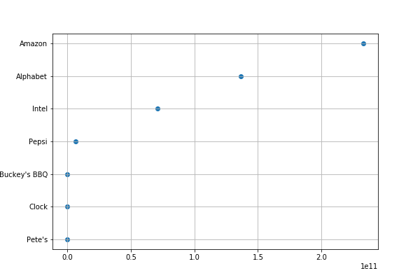
Amazon, Alphabet (Google), and Intel are many times larger than the small companies Pete’s, Clock, and Buckey’s BBQ (that we made up). The difference between them relative to Amazon is enormous, so the plot of each smaller company lies on the same vertical line 0 on the linear scale.
Matplotlib picks the scale for the axes if you do not set it explicitly. Here we did not. The little le11 notation at the bottom means that the xaxis is in scientific notation, which in this case means revenue is shown a multiple of 10**11 ($100 billion). Amazon’s revenue of $232,887,000,000 is 2.325*(10**11). While Pete’s $600,000, as a power of 11, is 0.000006*(10**11). This explains why even Pepsi, a large company, is close to 0 on the chart below as well.
So, we fix that issue in the next graph by using the logarithmic scale. See below for an explanation of the code.
import matplotlib.pyplot as plt
import numpy as np
import matplotlib.pyplot as plt
import numpy as np
import pandas as pd
data = {
"Pete's":           600000,
"Clock":           1600000,
"Buckey's BBQ":    2600000,
"Pepsi":        6466000000,
"Intel" :      70848000000,
"Alphabet":    136819000000,
"Amazon":      232887000000
}
df = pd.DataFrame.from_dict(data,orient='index',columns=['Revenue'])
dg =pd.to_numeric(df['Revenue'])
dc = pd.Series(dg.index.values.tolist()).to_frame('Company')
dat = df.assign(Company=dc.values)
data = dat.sort_values(by=['Revenue'])
plt.scatter(data['Revenue'],data['Company'])
plt.grid()
plt.show()

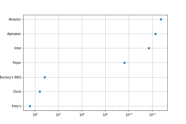
Here, everything is the same except we included plt.xscale(“log”). Now we can more easily see the values since they are powers of 10. So, Pete’s small $600,000 revenue is easy to see as it 6*(10**6). And Amazon’s is roughly 100,000 (10**5) times as large.
import matplotlib.pyplot as plt
import numpy as np
import pandas as pd
data = {
"Pete's":           600000,
"Clock":           1600000,
"Buckey's BBQ":    2600000,
"Pepsi":        6466000000,
"Intel" :      70848000000,
"Alphabet":    136819000000,
"Amazon":      232887000000
}
df = pd.DataFrame.from_dict(data,orient='index',columns=['Revenue'])
dg =pd.to_numeric(df['Revenue'])
dc = pd.Series(dg.index.values.tolist()).to_frame('Company')
dat = df.assign(Company=dc.values)
data = dat.sort_values(by=['Revenue'])
plt.scatter(data['Revenue'],data['Company'])
plt.grid()
plt.xscale("log")
plt.show()
Now you can more clearly see each company’s size by its revenue

Explaining the code
Some of this code may be difficult to understand without a familiarity with data science because it uses Pandas and NumPy. This is ironic, as Pandas was created particularly to make working with table-type data easier.
The first step takes the data we have created as a dictionary and converts it to a Pandas dataframe. The index for this data will be the company name. We said orient=’index’ that means take the first entry as the index value. Then we give it a column name with columns=[‘Revenue’]. The company name has no column name because it’s not a column; it’s a row index.
df = pd.DataFrame.from_dict(data,orient='index',columns=['Revenue'])
Next, we must convert the revenue strings to numbers. Otherwise they will be sorted by matplotlib as letters.
dg =pd.to_numeric(df['Revenue'])
Now we want to create a series, which is a dataframe with only one column. The values will be the index of the previous dataframe. That’s how we get the companies listed as a column of data, named Company.
dc = pd.Series(dg.index.values.tolist()).to_frame('Company')
Next, we add the values of the series we just created as another column in the dat dataframe.
dat = df.assign(Company=dc.values)
Then we plot the scatter chart giving it dataframes for the x and y values. Each has the same shape, (7,), which you can check with data[‘Revenue’].shape. Shape is a sometimes difficult NumPy concept. It basically means the dimension of the array. In an xy plot they must be the same.
plt.scatter(data['Revenue'],data['Company'])
The rest is self-explanatory:
plt.grid()
plt.xscale("log")
plt.show()


